The Elements of Design Part 1
"Design is not just what it looks like and feels like. Design is how it works." ~Steve Jobs
Think of the elements of design as the building blocks of design. The elements of design include form, light, scale, texture, pattern, and color. Form is defined as the basic shape and configuration of an object. and consists of lines and shapes. Lines indicate length or width and when you add the two together, you get a shape. Lines and shapes are two dimensional but a form is three dimensional. You now have volume and mass.
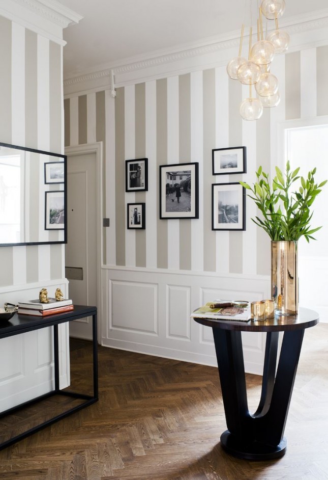
Lines are either horizontal, vertical, diagonal or curvilinear. Lines are used in interior design to give feeling to a space.
Horizontal lines represent rest. Frank Lloyd Wright used horizontal lines in many of his buildings. Look at Fallingwater for starters. Located in Pennsylvania, Wright demonstrated his use of tranquility by using horizontal planes. However, beware when using horizontal lines in an interior, because to many can visually bring down the ceiling.
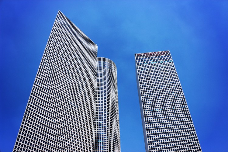
Vertical lines suggest wealth, strength, stability, and masculinity. Consider today's skyscraper for example. Skyscrapers exemplifies strength and upward movement. Used in interior design, vertical lines can suggest height.
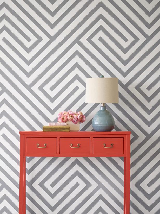
Diagonal lines create movement, speed, action, and diversity. Diagonal lines can bring life to a space, directing the eye upwards or downwards. They can also add volume to a space, making it feel larger than it is. However, if used incorrectly, diagonal lines can cause a sense of confusion and imbalance.
Curved lines are feminine, soft, and natural. They are also organic and playful. Curved lines can make a space flow. Be careful though, too many curved lines can be viewed as too feminine.
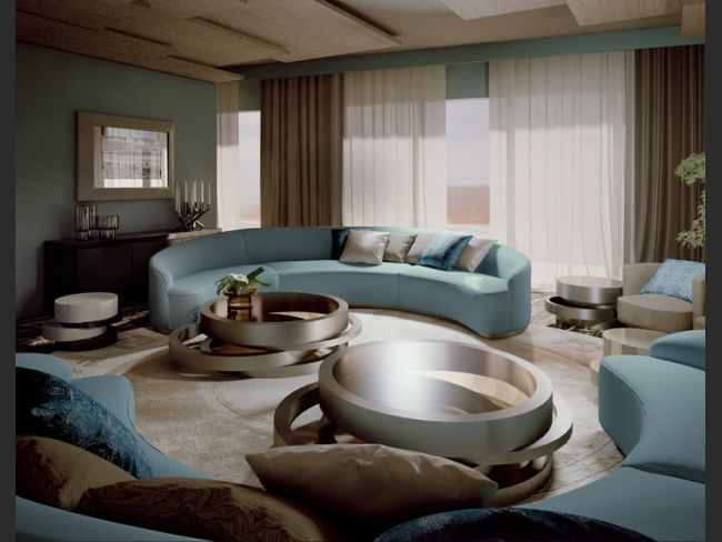
Shapes can be geometric or organic. Examples of geometric shape include squares, rectangles, triangles, and circles. Circles are often associated with feminine sensibility in contrast with rectangles and squares which take on more of a masculine feel.
Here is an example of geometric shapes.
Organic shapes are based on nature and living objects, whether animal, human, or plant. Here is an example of an organic form.

Form is three dimensional. Forms may be positive or negative. Unlike lines and shapes, form express width, length, and depth.
A pattern is formed when shapes are grouped together. Patterns can be combinations of one or more of the basic types of shapes. Designers use pattern to enhance visual interest and imply mood. Motifs, like shape, can be geometric or organic. Organic motifs include plants and flowers and can be both stylized or actual representations or an image. Patterns can convey a theme, such as traditional, country, casual, contemporary or sophisticated. The combination of patterns can produce a number of physiological and emotional responses. Care should be used that a room does not have too much pattern and that pattern selected complements each other and the space. For more on mixing patterns, click here.
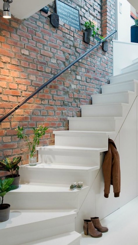
Texture refers to the physical qualities of materials. Texture can be rough, smooth, soft, hard, or glossy. Texture can be physical (actual) or implied (visual).
Some important facts about physical texture:
- Smooth textures are more formal
- Rough textures are more casual
- Smooth surfaces are easier to clean but show more dirt
- Rough textures are harder to clean but show less dirt
- Many surfaces are made of a variety of textures, such as brick and tile.
For more on how to use texture in interior design, click here.
I hope you learned something today. Come back again and we'll talk about scale, light and color.
Until next time...
Thanks for stopping by,


