Principles of Design Part 1
"Design is thinking...made visible." ~Saul Bass
Print by Susan Newberry Designs
The principles of design are the rules or guidelines that govern the use of the elements within a composition. The principles of design are proportion, balance, rhythm, contrast, emphasis & focus, and harmony & unity.
Proportion in interior design refers to the balance between design elements such as shape, color and texture. Dorothy Draper said, "If it looks right, it is right." If a space looks visually correct, it is probably in proportion.
Proportion is relative. It is a matter of judgement and situation. For example, an object can appear out of proportion in one setting and perfectly correct in another.
Balance refers to keeping a design from being too heavy or too light in an area. In design, balance is the arrangement of parts in a composition to achieve equality. Balance depends on the idea of visual weight. Equality in design occurs when objects have the same visual weight.
Large objects are heavier than smaller objects with the same form, shape, color, and texture. By grouping smaller objects together, you can achieve visual balance.
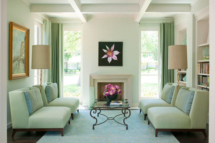
Symmetrical Balance is also known as a mirror image. It is a formal type of balance and best used in traditional and formal spaces.
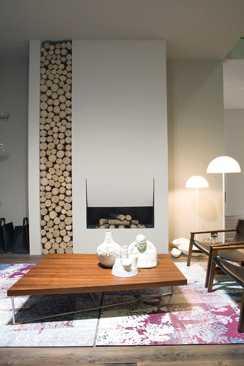
Asymmetrical balance is an informal balance that is accomplished by placing objects with similar visual weights equal distance from the center.
Radial balance is based on the circle and elements arranged around a central point, such as chairs around a round table.
A room is considered balanced if it contains a variety of textures in fabrics, flooring, and walls.
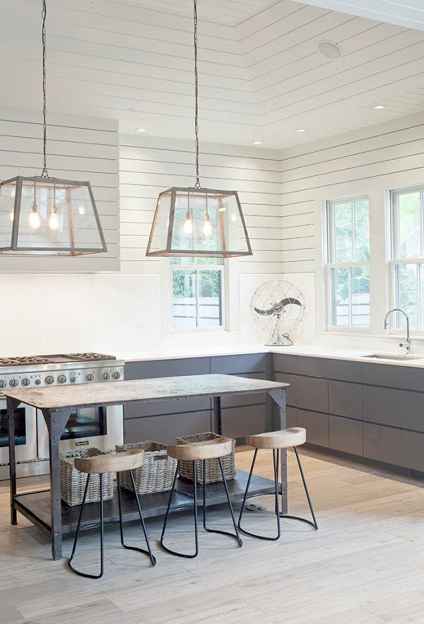
Rhythm means repeating a design element - color, tone, texture, line, shape, size or direction - within a design. You can add rhythm to a space in several ways:
- You can repeat a shape or a color to let your eye move throughout the room.
- Bring rhythm by repeating lines in the room - just like a musical beat. Repeat shapes in various forms around the room – circles, curves, or vertical lines.
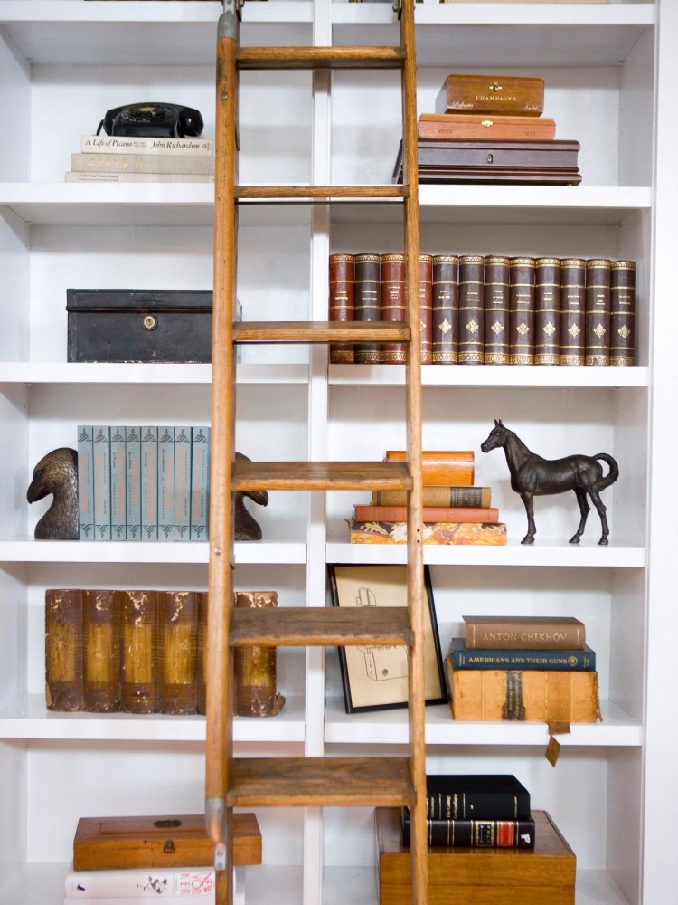
- Arrange items from small to large - in groupings of home accessories, placement of tables and picture frames.
- Make the room flow! An example of flow is when curved lines in the room lead the eye smoothly from one element to another without a jarring note.
- Add a little contrast! Repetition of shapes, lines, patterns and colors can be boring if you let it. Add a little contrast to create interest!
Rhythm in Architecture
Rhythm in Objects
Rhythm in Color
I hope you took something away from today's blog. Next time we'll talk about the remaining principles of design - focal point, harmony, and contrast.
Thanks for stopping by...
Until next time,


